Methodologies for Hiding Processes within Linux Systems
Abstract. Todo.
- Version: 0.1
- Author: Thibaud Ecarot
- Created: 14 January, 2023
- Update: 19 February, 2023
If you have any questions regarding what is written in this article, do not hesitate to send an e-mail via the e-mail address which is indicated on the home page.
Header
The list of various header types & its descriptions are provided below for your reference:
Light
Header with white background Color & Dark text. See below image and code for more information.
<!-- Header
============================ -->
<header id="header" class="sticky-top">
  <!-- Navbar -->
  <nav class="primary-menu navbar navbar-expand-lg">
    <div class="container-fluid">
      .....
    </div>
  </nav>
  <!-- Navbar End -->
</header>
<!-- Header End -->
Dark
Header with dark background & Light text. See below image and code for more information.
Add the .bg-dark and .navbar-text-light Class to the <nav> Tag to display a Dark Header.
<!-- Header
============================ -->
<header id="header" class="sticky-top">
  <!-- Navbar -->
  <nav class="primary-menu navbar navbar-expand-lg bg-dark navbar-text-light">
    <div class="container-fluid">
      .....
    </div>
  </nav>
  <!-- Navbar End -->
</header>
<!-- Header End -->
Box Layout Style
Default Layout Style is wide. Please add the .box class to the <body> Tag for box layout.
<body class="box" data-spy="scroll" data-target=".idocs-navigation" data-offset="125">Content
Documentation and examples for displaying typography, code, table, image and video and more..
Typography
Documentation and examples for typography, headings, body text, lists, and more.
Headings
| Heading | Example |
|---|---|
<h1></h1> |
h1. Heading |
<h2></h2> |
h2. Heading |
<h3></h3> |
h3. Heading |
<h4></h4> |
h4. Heading |
<h5></h5> |
h5. Heading |
<h6></h6> |
h6. Heading |
Lead
Make a paragraph stand out by adding .lead
Lorem Ipsum is simply dummy text of the printing and typesetting industry. Anim pariatur cliche reprehenderit, enim eiusmod high life accusamus terry richardson ad squid.
<p class="lead">
   Lorem Ipsum is simply dummy text of the printing and typesetting industry. Anim pariatur cliche reprehenderit, enim eiusmod high life accusamus terry richardson ad squid.
</p>
Inline Text elements
You can use the mark tag to highlight text.
This line of text is meant to be treated as deleted text.
This line of text is meant to be treated as no longer accurate.
This line of text is meant to be treated as an addition to the document.
This line of text will render as underlined
This line of text is meant to be treated as fine print.
This line rendered as bold text.
This line rendered as italicized text.
<p>You can use the mark tag to <mark>highlight</mark> text.</p>
<p><del>This line of text is meant to be treated as deleted text.</del></p>
<p><s>This line of text is meant to be treated as no longer accurate.</s></p>
<p><ins>This line of text is meant to be treated as an addition to the document.</ins></p>
<p><u>This line of text will render as underlined</u></p>
<p><small>This line of text is meant to be treated as fine print.</small></p>
<p><strong>This line rendered as bold text.</strong></p>
<p><em>This line rendered as italicized text.</em></p>
Code
Documentation and examples for displaying inline and multiline blocks of code
Inline code
Wrap inline snippets of code with <code>. Be sure to escape HTML angle brackets.
For example, <section> should be wrapped as inline.
For example, <code><section></code> should be wrapped as inline.Code blocks
Use <pre>s for multiple lines of code. Once again, be sure to escape any angle brackets in the code for proper rendering. You may optionally add the .pre-scrollable class, which will set a max-height of 340px and provide a y-axis scrollbar.
For example:
<p>Sample text here...</p>
<p>And another line of sample text here...</p>
Have to use something like:
<pre><code><p>Sample text here...</p>
<p>And another line of sample text here...</p>
</pre></code>
Syntax highlighter
We use Highlight Js for syntax highlight code snippet.
You can refer more information here: How to use highlight.js
Table
Documentation and examples for opt-in styling of tables.
iDocs is based on Bootstrap 4, so you can easily use Bootstrap's table classes to style your table. Bootstrap Documentation
Bordered
<table class="table table-bordered">
   .......
</table>| # | First | Last | Handle |
|---|---|---|---|
| 1 | Mark | Otto | @mdo |
| 2 | Jacob | Thornton | @fat |
| 3 | Larry | the Bird |
Striped
<table class="table table-bordered table-striped">
   .......
</table>| # | First | Last | Handle |
|---|---|---|---|
| 1 | Mark | Otto | @mdo |
| 2 | Jacob | Thornton | @fat |
| 3 | Larry | the Bird |
NoteYou can refer more information in Bootstrap Documentation here: Bootstrap Documentation
Icons
Font Awesome icon sets are used in iDocs.
<i class="fas fa-mobile-alt"></i>
<i class="fab fa-twitter"></i>
<i class="fas fa-credit-card"></i>
<i class="fab fa-facebook-f"></i>
NotePlease go to their official documentation pages for a full list of icons: Font Awesome
Image
Documentation and examples for opting images into responsive behavior and add lightweight styles to them—all via classes.
Responsive Images
Images in Bootstrap are made responsive with .img-fluid. max-width: 100%; and height: auto; are applied to the image so that it scales with the parent element.

<img src="assets/images/screenshot.jpg" class="img-fluid" alt="Responsive image">Image lightbox
Show image popup when click on image:
<a class="popup-img" href="assets/images/screenshot.jpg">
  <img src="assets/images/screenshot-thumb.jpg" class="img-fluid img-thumbnail" alt="image">
</a>
Image Lightbox with Link
Show image popup when click on link: Click Here for Popup Image
<a class="popup-img" href="assets/images/screenshot.jpg">Click Here for Popup Image</a>Image lightbox with Button
Show image popup when click on button: Click Here for Popup Image
<a class="btn btn-primary popup-img" href="assets/images/screenshot.jpg">Click Here for Popup Image</a>Video
Create responsive video embeds based on the width of the parent by creating an intrinsic ratio that scales on any device.
Embedded Video
Wrap any embed like an <iframe> in a parent element with .embed-responsive and an aspect ratio. The .embed-responsive-item isn’t strictly required, but we encourage it.
<div class="embed-responsive embed-responsive-16by9">
  <iframe class="embed-responsive-item" src="https://www.youtube.com/embed/7e90gBu4pas" allowfullscreen></iframe>
</div>NotePlease go to official bootstrap documentation for a full information of embed video: Bootstrap Documentation
Popup with Video
Show Youtube and Vimeo video popup when click on link:
<a class="popup-youtube" href="http://www.youtube.com/watch?v=7e90gBu4pas">Open Popup YouTube Video </a><a class="popup-vimeo" href="https://vimeo.com/45830194">Open Popup Vimeo video</a>Components
Setting up components is very easy. Here is the Some of shortcodes describe. also, iDocs is based on Bootstrap 4, so you can easily use Bootstrap's components: Bootstrap Documentation
Accordion
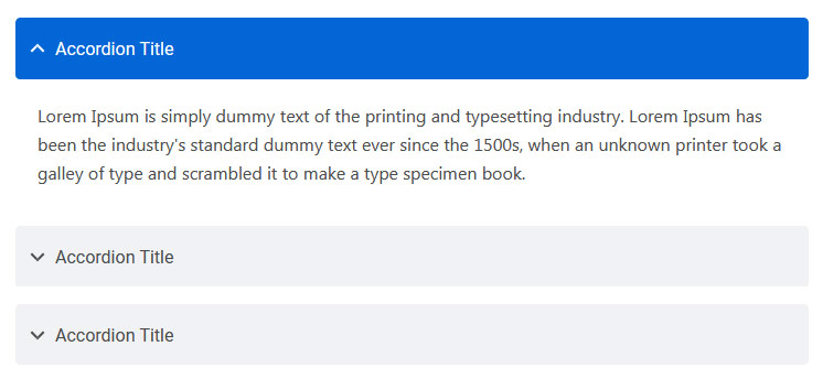
You can extend the default collapse behavior to create an accordion. To properly achieve the accordion style, be sure to use .accordion as a wrapper.
See below image and code for more information.
<div class="accordion" id="accordionDefault">
  <div class="card">
    <div class="card-header" id="headingOne">
      <h5 class="mb-0"> <a href="#" data-toggle="collapse" data-target="#collapseOne" aria-expanded="true" aria-controls="collapseOne">Accordion Title</a> </h5>
    </div>
    <div id="collapseOne" class="collapse show" aria-labelledby="headingOne" data-parent="#accordionDefault">
      <div class="card-body">This is Accordion Content</div>
    </div>
  </div>
  <div class="card">
    <div class="card-header" id="headingTwo">
      <h5 class="mb-0"> <a href="#" class="collapsed" data-toggle="collapse" data-target="#collapseTwo" aria-expanded="false" aria-controls="collapseTwo">Accordion Title</a> </h5>
    </div>
    <div id="collapseTwo" class="collapse" aria-labelledby="headingTwo" data-parent="#accordionDefault">
      <div class="card-body">This is Accordion Content</div>
    </div>
  </div>
  <div class="card">
    <div class="card-header" id="headingThree">
      <h5 class="mb-0"> <a href="#" class="collapsed" data-toggle="collapse" data-target="#collapseThree" aria-expanded="false" aria-controls="collapseThree">Accordion Title</a> </h5>
    </div>
    <div id="collapseThree" class="collapse" aria-labelledby="headingThree" data-parent="#accordionDefault">
      <div class="card-body">This is Accordion Content</div>
    </div>
  </div>
</div>
Options:
| Type Class | Features | Code Example |
|---|---|---|
.accordion-alternate |
Alternate Minimal Style for the accordions. | |
.arrow-right |
For set arrow in right side in accordions | |
Tabs
Default Bootstrap Nav component combined with iDocs for unique tabs.
See below image and code for more information.
<ul class="nav nav-tabs" id="myTab" role="tablist">
  <li class="nav-item" role="presentation">
    <a class="nav-link active" id="home-tab" data-toggle="tab" href="#home" role="tab" aria-controls="home" aria-selected="true">Home</a>
  </li>
  <li class="nav-item" role="presentation">
    <a class="nav-link" id="profile-tab" data-toggle="tab" href="#profile" role="tab" aria-controls="profile" aria-selected="false">Profile</a>
  </li>
  <li class="nav-item" role="presentation">
    <a class="nav-link" id="contact-tab" data-toggle="tab" href="#contact" role="tab" aria-controls="contact" aria-selected="false">Contact</a>
  </li>
</ul>
<div class="tab-content my-3" id="myTabContent">
  <div class="tab-pane fade show active" id="home" role="tabpanel" aria-labelledby="home-tab">This is Tab Content Home</div>
  <div class="tab-pane fade" id="profile" role="tabpanel" aria-labelledby="profile-tab">This is Tab Content Profile</div>
  <div class="tab-pane fade" id="contact" role="tabpanel" aria-labelledby="contact-tab">This is Tab Content Contact</div>
</div>
Options:
| Type Class | Features | Code Example |
|---|---|---|
Basic Navs |
Basic Navs Style for the Tabs | |
.nav-separator |
Basic Navs Style with Separator for the Tabs | |
.nav-tabs |
Tabs Navs Style for the Tabs. For example - above Preview Example. | |
.nav-pills |
Pills Navs Style for the Tabs | |
Helper Classes
We have created some really useful helper classes for you. Here are a few of them. also, You can refer other default bootstrap helper classes here: Bootstrap Documentation
Text Size:
.text-0- Changes the Font size to 11px..text-1- Changes the Font size to 12px..text-2- Changes the Font size to 14px..text-3- Changes the Font size to 16px..text-4- Changes the Font size to 18px..text-5- Changes the Font size to 21px..text-6- Changes the Font size to 24px..text-7- Changes the Font size to 28px..text-8- Changes the Font size to 32px..text-9- Changes the Font size to 36px..text-10- Changes the Font size to 40px..text-11- Changes the Font size to 44px..text-12- Changes the Font size to 48px..text-13- Changes the Font size to 52px..text-14- Changes the Font size to 56px..text-15- Changes the Font size to 60px..text-16- Changes the Font size to 64px..text-17- Changes the Font size to 72px..text-18- Changes the Font size to 80px..text-19- Changes the Font size to 84px..text-20- Changes the Font size to 92px.
Font Weight:
.font-weight-100- For font weight of 100..font-weight-200- For font weight of 200..font-weight-300- For font weight of 300..font-weight-400- For font weight of 400..font-weight-500- For font weight of 500..font-weight-600- For font weight of 600..font-weight-700- For font weight of 700..font-weight-800- For font weight of 800..font-weight-900- For font weight of 900.
Background Color:
.bg-transparent- For background color of transparent.bg-light- For background color of light gray.bg-light-1- For background color of more light gray.bg-light-2- For background color of more light gray.bg-light-3- For background color of more light gray.bg-light-4- For background color of more light gray.bg-dark- For background color of dark.bg-dark-1- For background color of dark gray.bg-dark-2- For background color of more dark gray.bg-dark-3- For background color of more dark gray.bg-dark-4- For background color of more dark gray
Box Shadow
.shadow-none- For No shadow to elements with box-shadow utilities..shadow-sm- For Small shadow to elements with box-shadow utilities..shadow- For Regular shadow to elements with box-shadow utilities..shadow-md- For medium light shadows to elements with box-shadow utilities..shadow-lg- For Larger shadows to elements with box-shadow utilities.
Opacity
.opacity-1- For 10% opacity..opacity-2- For 20% opacity..opacity-3- For 30% opacity..opacity-4- For 40% opacity..opacity-5- For 50% opacity..opacity-6- For 60% opacity..opacity-7- For 70% opacity..opacity-8- For 80% opacity..opacity-9- For 90% opacity.
Border Radius
.rounded-top-0- No Border Radius for top..rounded-bottom-0- No Border Radius for bottom..rounded-left-0- No Border Radius for left..rounded-right-0- No Border Radius for right.
Borders, Sizing, Spacing (margin & padding) and also much more....
FAQ
A FAQ is a list of frequently asked questions (FAQs) and answers on a particular topic.
Support
If this documentation doesn't answer your questions, So, Please send us Email via Item Support Page
We are located in GMT +5:30 time zone and we answer all questions within 12-24 hours in weekdays. In some rare cases the waiting time can be to 48 hours. (except holiday seasons which might take longer).
Don’t forget to Rate this template
Go to your Themeforest Profile > Downloads Tab > & then You can Rate & Review for our template.
Thank You.
Changelog
See what's new added, changed, fixed, improved or updated in the latest versions.
For Future Updates Follow Us @themeforest / @facebook / @twitter / @Dribbble
Version 1.1 (12 Oct, 2020)
- Added Your information here for added new feature
- Fixed Some minor bugs for browser compatibility
- Fixed Some minor bugs for responsive
- Updated FontAwesome to Latest Version
- Updated Bootstrap to Latest Version
- Updated Improvements in CSS and JS
Version 1.0 (8 April, 2020)
Initial Release


